Tableau Highlights
By: Christine Stonos
I recently attended the 3-day Tableau Conference held in San Diego. The conference was filled with different sessions, meet-ups, and hands-on labs. There was so much to see and do that there was no possible way that one person could have attended everything, and I was no exception. However, I wanted to share some highlights with you under this disclaimer. I did not attend every session, but these two sessions were the highlights of the conference for me.
Most interesting: Design Dashboards for the Mind’s Eye
Steven Franconeri, Professor of Psychology at Northwestern University
I get the impression that most people who work in data are quite methodical when it comes to their decision-making processes. They don’t tend to make choices or decisions on a whim, but instead they will let the data tell them what they should do. Given the nature of their work, this is understandable. This was also why this session was so interesting to me.
The speaker, Steven Franconeri, is a professor of Psychology at Northwestern University. In this session, Steven spoke about the science behind visual analytics; how our brains process information, and how we can build our dashboards so that our brains are more likely to quickly understand the data.
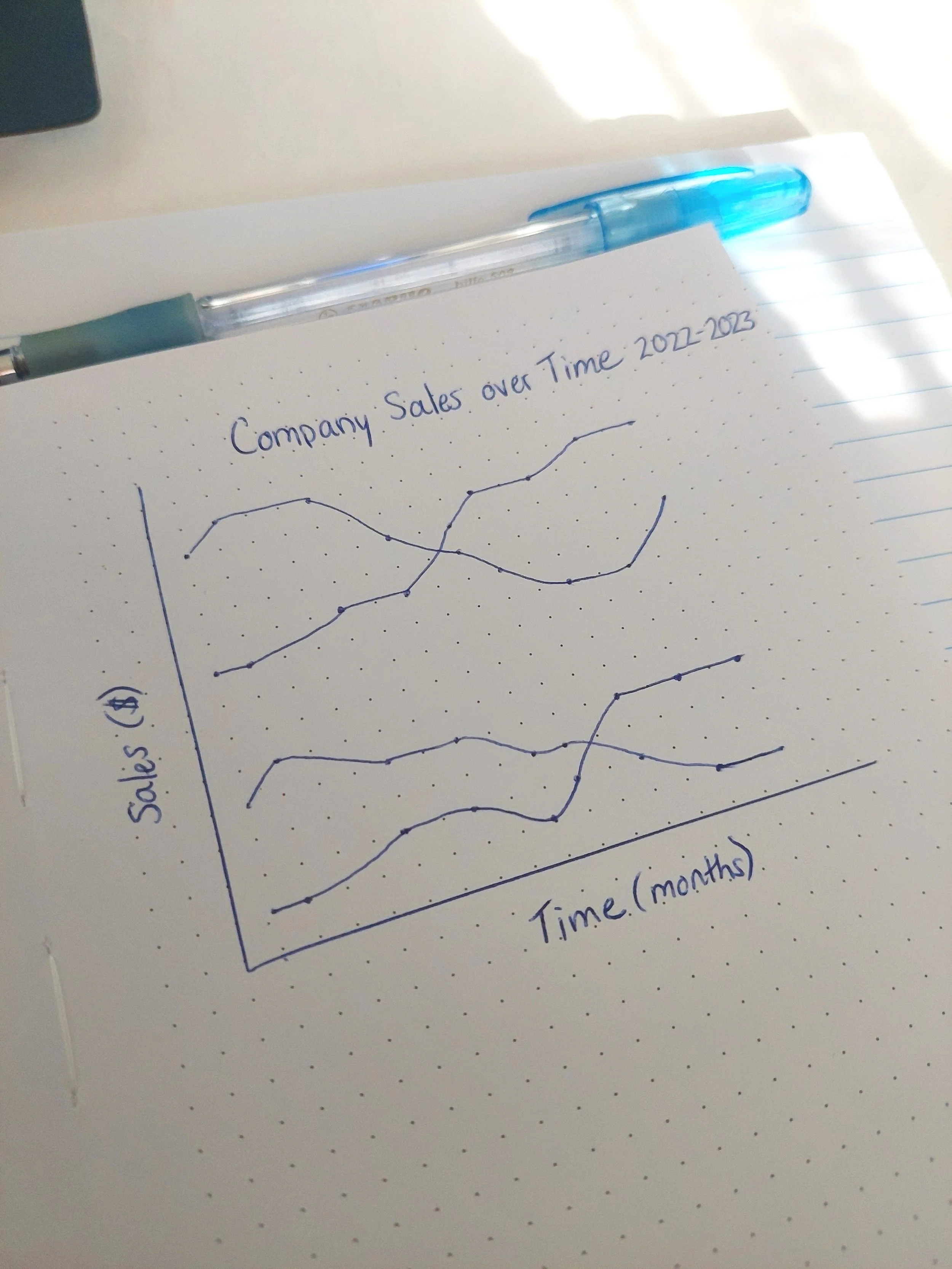
Artist's rendition of chart from presentation
My favourite part of the presentation was when he showed us a line chart with four lines and two points of interest. Then he proceeded to highlight one of the points of interest and tell us a story about what is happening with the data. Then, he flipped the script and pointed out that the same story could easily be used to describe the other point of interest on the chart. The point of this exercise was to demonstrate that just because something might be obvious to you (as a data analyst), doesn’t mean that your end user will see the same thing. He went on to explain techniques to building dashboards that use what we know about the brain to build better chats that are easier to understand for our end users.
To put it a different way, Steven showed us the science and research behind how the brain processes things visually, and how we can use what we know about the brain to build better charts that are easier/faster for end users to understand. Data analysts make thousands of decisions when it comes to building a dashboard; so a session like this provided data in the form of scientific insights to help them make those decisions.
Most entertaining: Chart Chat
The faces of Chart Chat
Chart Chat was the other session that really stood out to me. There was great energy in the room, right from the start, and I think it likely had a lot to do with the presenters; Andy Cotgreave, Jeffery Shaffer, Steve Wexler, and Amanda Makulec. There were not many sessions that had 4 different presenters speaking in 40 minutes, and each of these presenters had a lot of experience and a lot to say.
The presenters run a live video series called ‘Chart Chat’ where, as the name suggests, they discuss charts. They talk about chats that they have generated, charts that they find in the media, and they discuss the different types of charts, and why they are effective or ineffective for visual analytics.
This presentation was more like a demonstration. They discussed a chart that was found in the media, which was a poor representation of how the cost of living has affected grocery prices. Then, using that same data set, each presenter discussed how they would change the chart into a better visualization. The result was four, very different charts that each told its own story.
What I liked the most about this session was hearing the thought processes that each presenter went through as they analyzed the data and considered how best to represent it. My favourite chart ended up being Amanada’s; she used one item (eggs) to highlight her point – how many eggs does $10 buy you?
Andy tested the water of AI technology and asked Chat GPT how it would change the chart. He got a big laugh from the audience as he showed the Chat GPT chart, a nonsensical line-chart visualization, and exclaimed how our jobs are still safe.
Steve brought up an excellent point during his part of the presentation. He explained how the data in this chart was unverifiable. He spent more of his allotted time discussing how he worked to fact check the data in the chart, than on how to create the visual representation. As a former journalism student, this really caught my attention. I was surprised by my reaction and how little I cared about the charts created when Steve pointed out that the data may not be sound.
Final Thoughts
These two sessions from the conference stood out to me the most. They were not only interesting and entertaining, but also inspiring. Given how many sessions were in high demand at this conference, I would often rush off to the next one immediately after the session. However, in this case, I took the time to wait and speak to the presenters. I will be taking an online course on data storytelling offered by Steven Franconeri, as well as following the live video series Chart Chat. Follow along for more updates.


