Getting Started w/ Alteryx Designer
There are a few tools that I use daily in my work life:
Notion
Alteryx
Tableau
Gmail
Calendar
Each tool has a place in my ecosystem and provides immense value; I could not function without them. While each tool deserves its little blurb on what it is and how I use it, in this post, I will focus on Alteryx.
What is Alteryx?
Alteryx is a software company that focuses on making analytics available for everyone. From their website:
The Alteryx Analytics Automation Platform delivers end-to-end automation of analytics, machine learning, and data science processes that accelerate digital transformation.
That is a lot of fancy talks that loosely translates to: “It is a powerful platform that enables anyone to become a top-level analyst. In today’s world, where data is king, operators with decent data literacy significantly outperform peers.
A snippet from the Alteryx Website. Source: https://www.alteryx.com/why-alteryx (Jun 7, 2022)
Why I love it!
Alteryx is a core tool that has automated my work-life! Many complex and “impossible” problems were thrown at me with the expectation that I would fail, and I knocked them out of the park with this tool. This tool is so good that I was able to automate the majority of my job, freeing my time so that I can solve more problems, enhance solutions that are already in play, and enjoy my vacation without work interruptions.
Often when working on solving problems, many data challenges need to be addressed. Be it bringing in multiple data sources together, automating cleansing tasks, sending mass emails to your sales team, or automatically sending reports even when I’m not at my desk (great for enjoying uninterrupted holidays!)
Here is my configuration
Alteryx Designer doesn’t have extensive customization, which is a good thing. Typically I use any software as vanilla as possible so that the environment is familiar if I move to another computer or someone else’s computer.
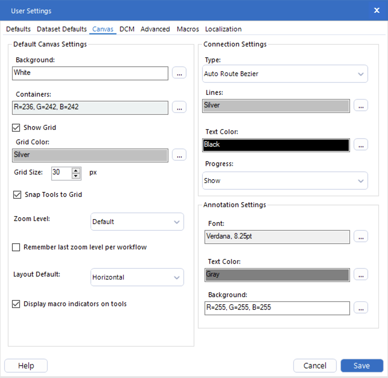
However, with Alteryx Designer, there are a few settings that are a must change for me:
Grid size
Wire color
Always show progress
Default fonts
User settings for the Canvas. Pay attention to the grid size, snap tools to grid, and display macro indicators on tools, lines, progress, annotation settings, font, and text color.
User settings for Localization. Pay attention to the default system font, default distance units, and the date format (messages).
Why bother?
You can gain an advantage by being structured and organized, especially when working on larger projects. Some of these workflows can take a few minutes to build and trace, and others can take several months. There will be times when you have to trace your process tool by tool to understand the behavior and come to the correct answer.
Few tools on the canvas, no problem!
With lots of tools on the canvas, things can get tricky. This isn’t the largest workflow I’ve worked on! I built this workflow to perform cash reconciliation, taking data from different vendors who utilize other formats and matching it against the client’s master client list. There are many steps and matching patterns that the process could leverage.
For small, simple workflows, aligning and spacing tools don’t matter as much. But things can get complicated very quickly! When you have a workflow with 100+ tools and embedded macros and things all over the place, being organized is very helpful!
Why the grid size?
The default grid size is relatively small and works, but then it isn’t as easy to align stuff. Here are some available options:
No visible grid with snapping disabled
An exagerated view, but I see this often. It looks clean but lining it up isn’t straightforward. Yes, it’s true; I can select the tools, right-click and choose: “Align Horizontally,” and then select the tools, right-click and choose: “Distribute Horizontally.” But that’s a total of six clicks!
Visible default grid with snapping enabled
With the grid, it is a bit easier to align because everything snaps. But the grid looks crowded and still not obvious how to keep things aligned and space.
Visible custom grid with snapping enabled
With the grid visible and set to 30px, I can drop the tools in the proper position off the bat and not have to worry about alignment or spacing! It saves me a lot of clicks and is fantastic for my peace of mind!
I have done extensive research (it lasted 10 minutes) to find out that each tool is about 30px wide, and a grid size of 30px is the perfect height and width spacing for the tools. In the interest of saving clicks, being organized, and making my workflows easier, this is as zen as it gets!
The cleanest possible look: invisible grid, snapping on, do not show progress
While this is a clean look and very acceptable (because everything is aligned and even), my personal preference is still to show the grid and show all progress.
Why Always Show Progress?
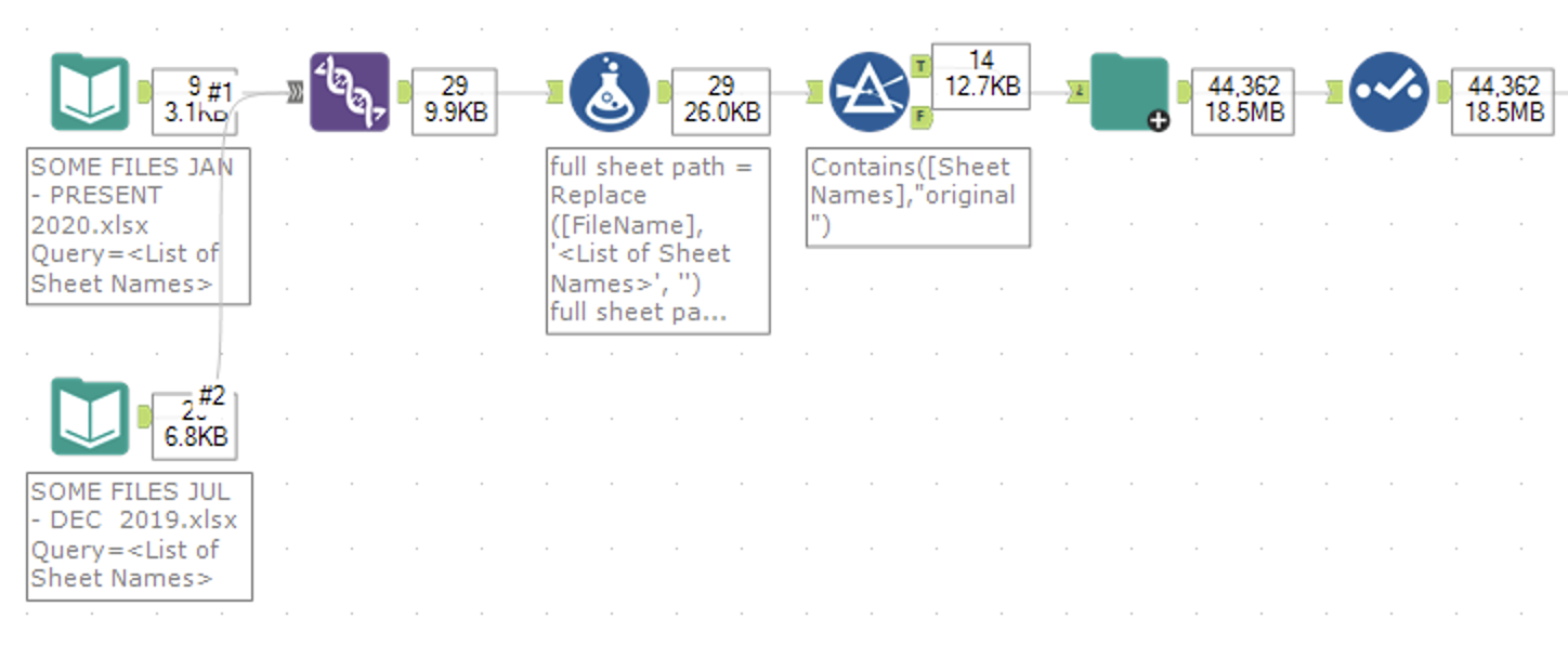
When working with tools like Joins and Filters, you will often want to see how many records are going into the tool and how many are going out. The progress annotation adds some clutter, but it is hugely important to be able to debug and trace things at a glance, making sure your workflow is working as expected.
Here is a snippet from a workflow that takes free-form text fields and uses RegEx to pattern match, looking for account numbers that match the customer’s master list.
And you also have a setting for the line color?
Starting to think I’m a lunatic yet? If you are, you are probably not wrong!
Comparing the light lines and the dark lines. The light lines make the numbers easier to read and the tools stand out more to me.
The tools are the essential items on the canvas, so I want them to stand out. When the lines are in the default black, they stand out pretty hard. It makes it look like ink on paper, and I find it distracting. With the lighter wires, it seems more like a pencil on paper and takes a back seat. You can still see how the tools are connected, but it’s not distracting.
Both options are okay. Since my tools always show progress, I find it easier to read with lighter lines.
Conclusion
By being organized and well structured, you can make it very easy for others to read the workflow and helps you follow the process if you have to review it years later. When I build a solution, my main focus is to solve the problem at hand, and the next priority is to make it readable for the next person. Ideally, I will never have to look at this again, and I can move on to a different challenge.
Real estate on the screen is important, and if you spend many hours staring at a screen working on some data, why not do yourself a favor and be organized about it (and make it easy to be organized)?
All the items listed here are my personal preference. There is no right or wrong answer here, so go ahead and give it a try, see what works best for you and roll with it!
What are your favorite settings to change when using Alteryx?


